Choropleth map of South Asia
Paste your numbers by country and get a colour-coded map with a legend.
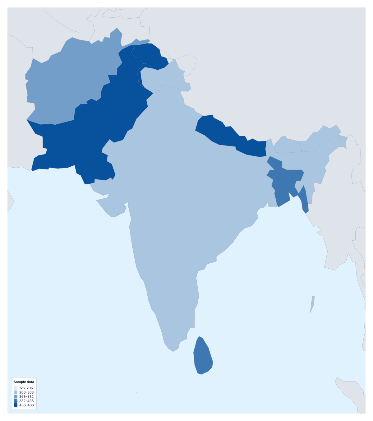
Your data on a map of South Asia
If you have one figure for each country of South Asia, this page turns it into a shaded map. Paste two columns from your spreadsheet, the country and its value, and Make my map opens the region with its eight countries coloured by your numbers. The colours above are sample values until you paste your own.
What a choropleth does
A choropleth colours each area by a value, here each country, usually darker for more, with a legend to read the shades by. Eight countries is a small set, which makes the pattern easy to take in at a glance. It suits rates better than totals, and it cannot show single points such as offices; use pins in the editor for those.
What people map for the region
A company with customers in several countries maps orders or revenue per person to see where it is under-sold. A researcher or charity maps a health or schooling measure, such as the share of children enrolled, which compares fairly between large and small countries. Tourism boards chart visitors; a survey team shows one satisfaction score per country on a single scale.
Putting the table in
One row per country, name first and value second. Names in several spellings and ISO 3166 codes both match, and rows that do not are listed with suggestions to fix or skip. The blank spreadsheet on this page already has the eight countries and an empty Value column. Pastes can run to 5,000 rows and 2 MB, far more than eight rows need.
Colour steps for eight countries
Aim for three steps; with four or five, some shades would hold a single country. Quantile gives each step about the same number of countries, while Natural breaks follows the gaps in your numbers. Use one colour for low-to-high figures and two colours when values sit above and below a midpoint. To set the region within the continent, paste the same table into the choropleth map of Asia.
How to do it in MapMaker
- Copy the country and value columns from your spreadsheet and paste them into the box.
- Choose Make my map to open South Asia with your figures, or Upload a CSV if the table is a saved file.
- Fix or skip any unmatched rows, then pick Quantile and three classes in the Data panel.
- Choose Download to save the map and its legend as a PNG, SVG or PDF.
Facts about South Asia
This map shows the eight countries of South Asia that make up SAARC. 8 members are on the map. The members are Afghanistan, Bangladesh, Bhutan, India, Maldives, Nepal, Pakistan and Sri Lanka.
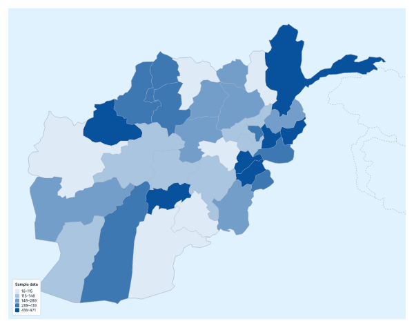
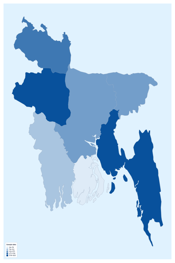
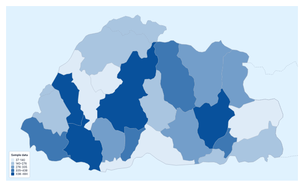
Maps of places in South Asia

Questions people ask
Which countries can I add data for on the map of South Asia?
Eight: Afghanistan, Bangladesh, Bhutan, India, Maldives, Nepal, Pakistan and Sri Lanka. Give each one a row, or download the blank spreadsheet on this page to get the eight rows with their codes.
Which names and codes for the countries does it recognise?
English names and many other spellings, with or without accents, and ISO 3166 country codes. Accents and capital letters do not matter, so a table copied from a report usually goes in without editing.
Is eight countries enough for a choropleth?
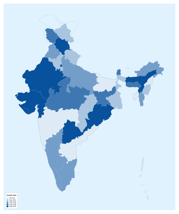
Yes, for a comparison. With eight areas, three colour steps keep each shade meaningful. If you need detail inside a country, use the choropleth map of India, which colours its states.
Can I map categories instead of numbers?
Yes. Put a label such as phase one or phase two in the value column and choose the Categories method in the Data panel. Each label gets its own colour and a line in the legend.