Choropleth map of Spanish-speaking countries
Paste your numbers by country and get a colour-coded map with a legend.
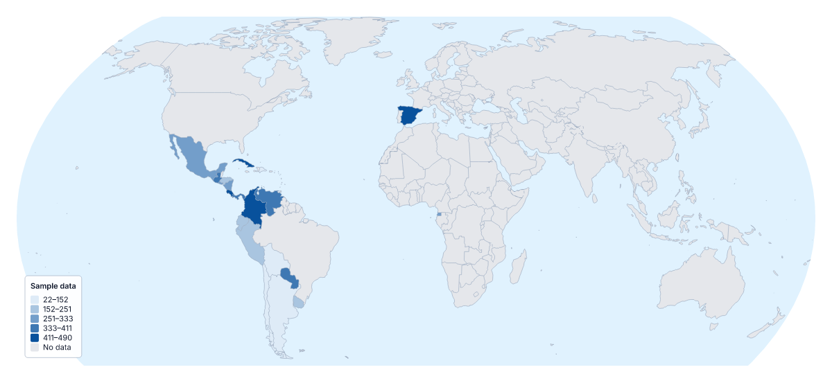
Your data on a map of Spanish-speaking countries
If you have one figure for every Spanish-speaking country on the map, this page can shade them by it. Paste two columns from your spreadsheet, the country and its value, and Make my map opens the map with the 20 countries coloured by your numbers. The colours above are sample values until you paste your own.
What it shows
A choropleth shades each area by a value, usually darker for more, and a legend explains the shades. With 20 countries you can compare them at a glance. It reads best with rates and does not give exact figures, so keep a table beside it if the numbers matter.
Data people map here
Language-learning companies map enrolments per person by country. Market researchers map orders, customers or survey scores for a Spanish-language campaign. Education teams map school results or reading levels. A course provider can use the Categories method to mark where its course is offered, with one colour per delivery partner.
Getting your data in
One row per country: the name in the first column, the value in the second. English or Spanish names and ISO 3166 codes all match. Unmatched rows are listed to fix, skip or remember. The blank spreadsheet on this page has all 20 rows. A paste can hold 5,000 rows and 2 MB, far more than 20 rows need.
Colours
Three or four steps are enough for 20 countries. Quantile puts a similar number of countries in each step, and Equal steps gives each step the same range of values. A one-colour scale suits figures that run from low to high; a two-colour scale suits change above and below a midpoint. Only the 20 members take a value; for figures covering every country, not only these 20, use the choropleth map of the world instead.
How to do it in MapMaker
- Copy the country column and the value column from your spreadsheet and paste them into the box.
- Choose Make my map to open the map with your figures, or Upload a CSV if the table is saved as a file.
- Fix or skip any rows the editor could not match, then pick a method and three or four classes in the Data panel.
- Choose Download to save the map with its legend as a PNG, SVG or PDF.
Facts about Spanish-speaking countries
This map shows the countries where Spanish is an official language. 20 members are on the map.
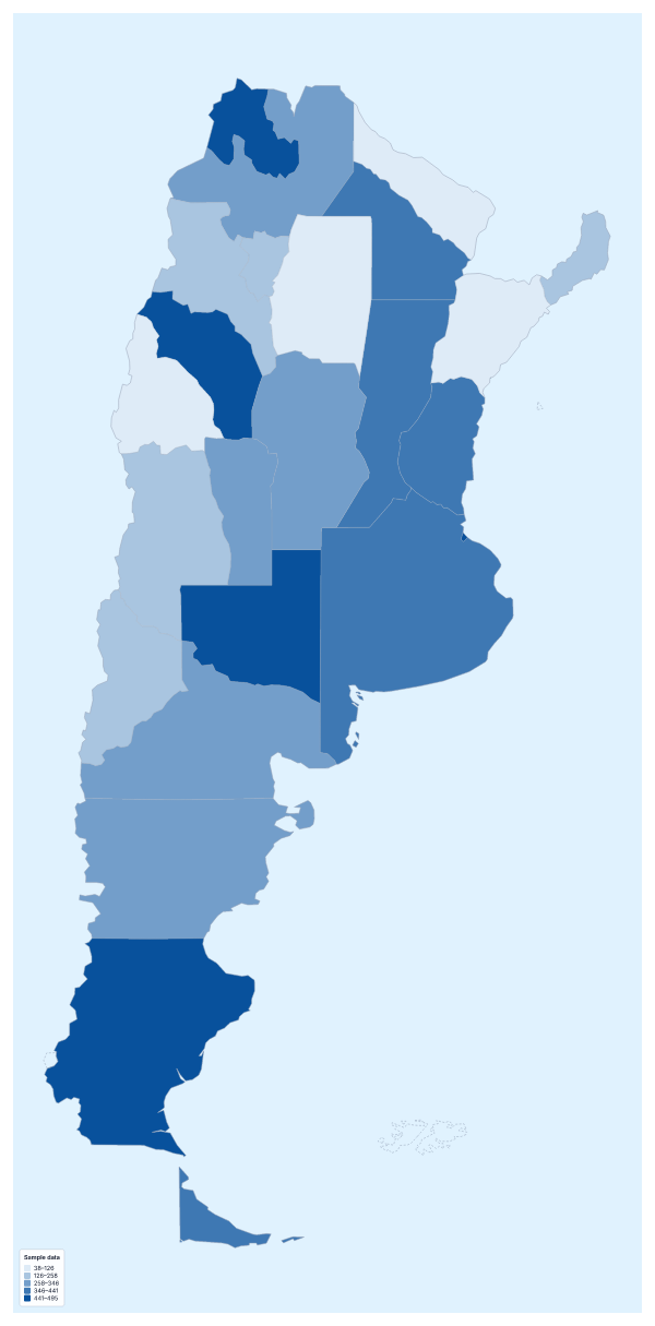
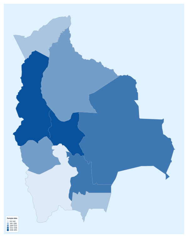
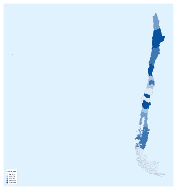
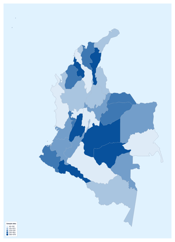
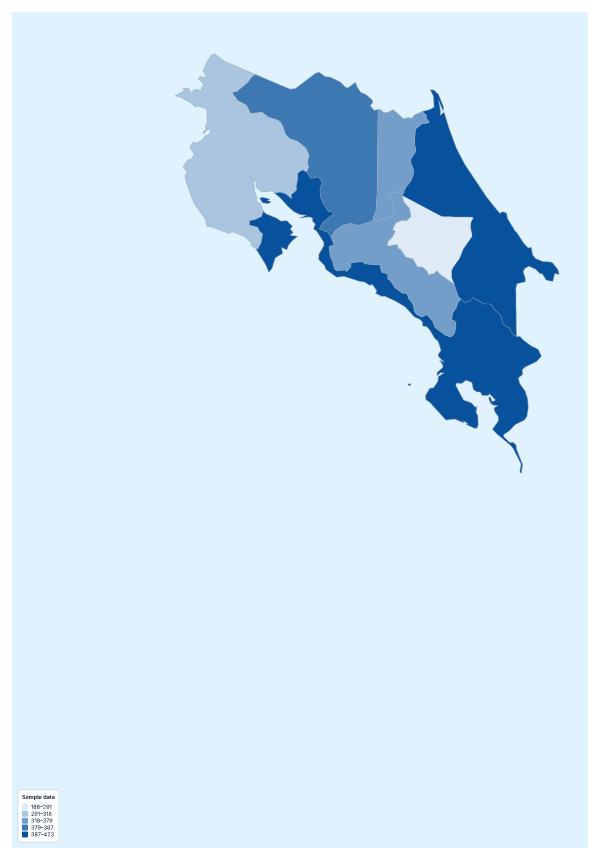
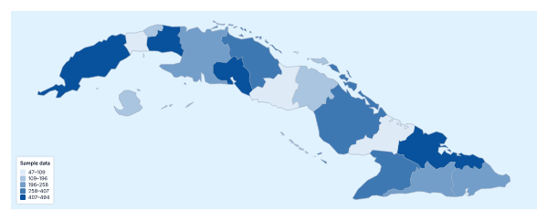
Maps of places in Spanish-speaking countries
Questions people ask
Which countries can I add data for on the map of Spanish-speaking countries?
The 20 countries on the map, from Argentina and Bolivia to Uruguay and Venezuela, including Spain and Equatorial Guinea. The blank spreadsheet on this page lists all 20 with a code each and an empty Value column.
Can my table use Spanish country names?
Yes. The importer matches names in several languages and spellings, with or without accents, so a table in either language usually goes in as it is. Rows it cannot match are listed with suggestions.
Should I map totals or rates?
Rates, in most cases. A total tends to follow how many people live in each country, so the largest come out darkest. Dividing by population shows the pattern behind the figures.
Can I map categories instead of numbers?
Yes. Put a label such as launched or planned in the value column and choose the Categories method in the Data panel. Each label gets its own colour and a line in the legend.