Choropleth map of the Americas
Paste your numbers by country and get a colour-coded map with a legend.
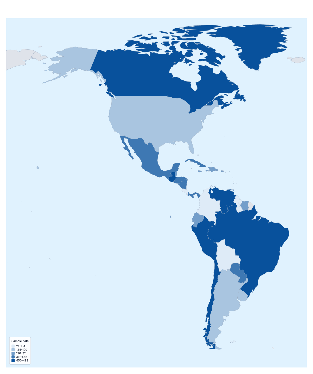
Your data on a map of the Americas
If you have a number for each country in the Americas, this page can colour them by it. Paste two columns from your spreadsheet, the country and its value, and Make my map opens the map with the 52 countries and territories coloured by your figures. The colours above are sample values, there until you paste your own.
How the colours read
A choropleth colours every area by a value, darker for more, with a legend to read the shades by. It is quick for comparing countries side by side and best with rates per person or per km². It does not give exact figures, and a point such as a single office needs a pin instead.
Data that suits the Americas
A company with customers across several countries can map orders per person to see where it is strongest. Health researchers map vaccination or hospital figures, economists map income per person, and an election team can map results with the Categories method, one colour for each winning party. Teachers use survey results the same way.
Getting your data in
One row per country or territory, with the name in the first column and the value in the second; ISO 3166 codes match too. Rows that do not match are listed with suggestions, to fix or skip. The blank spreadsheet on this page gives you every row with an empty Value column, which saves typing 52 names. Pastes can hold 5,000 rows and 2 MB.
Choosing the colours
With 52 areas you can use five or six steps and each will hold several. Quantile puts about the same number of countries in each, Equal steps keeps the legend ranges the same width and Natural breaks follows gaps in your figures. The smallest territories are drawn tiny, so give a table or a pin to anything whose value matters. For a closer look at one part, paste a table into the choropleth map of South America.
How to do it in MapMaker
- Copy your country column and the value column and paste them into the box.
- Choose Make my map to open the Americas with your figures, or Upload a CSV if the table is a saved file.
- Fix or skip rows the editor could not match, then pick a method and five or six classes in the Data panel.
- Choose Download to save the map and its legend as a PNG, SVG or PDF.
Facts about the Americas
52 members are on the map.
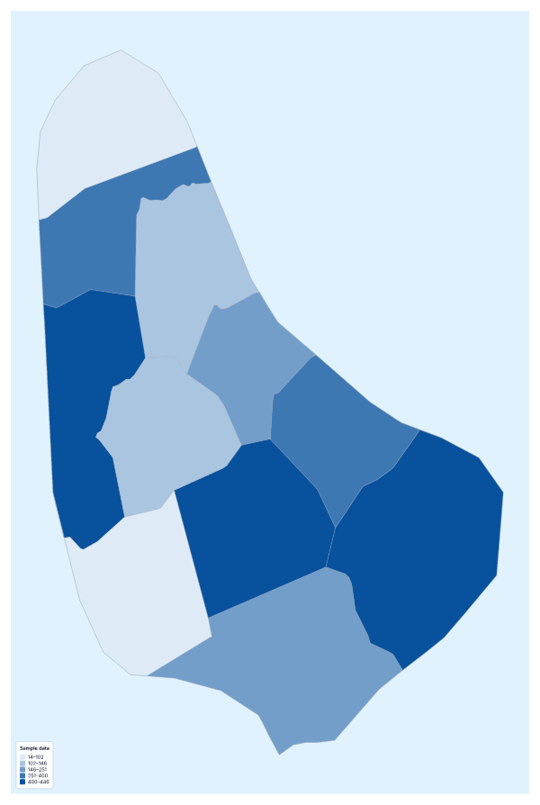
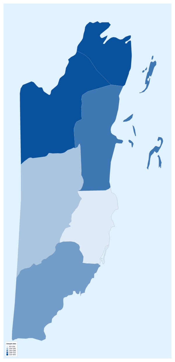
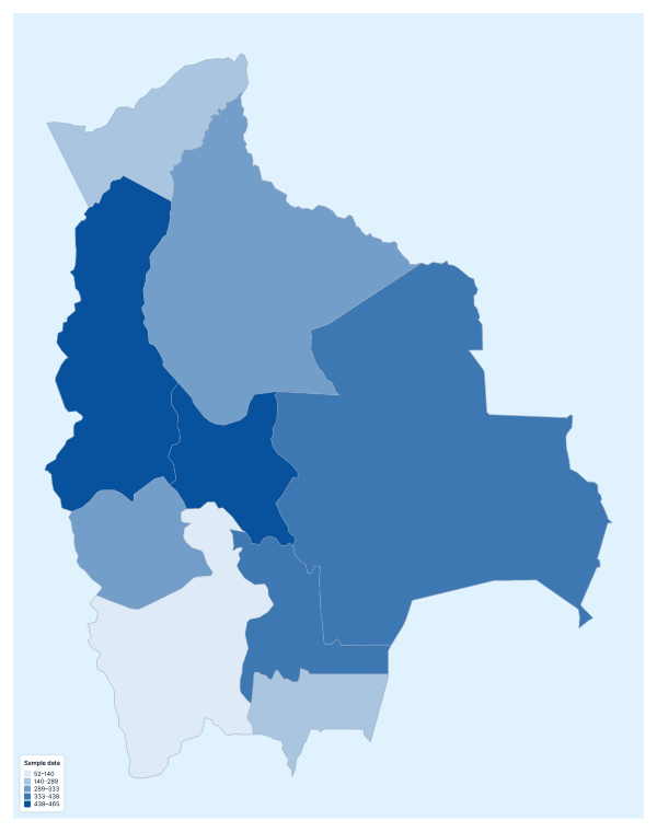
Maps of places in the Americas
Questions people ask
Which countries can I add data for on the map of the Americas?
All 52 countries and territories on the map. Give each one a row in the table, or download the blank spreadsheet on this page to get every row with a code the importer accepts and an empty Value column.
What if my data covers only some of the countries?
Leave the others out. Any country without a value takes the no data colour, which you can set in the Data panel, so the gaps in your table show plainly instead of being guessed.
Should I map totals or rates for the Americas?
Rates, in most cases. Totals tend to follow where the most people live, so the most populous countries come out darkest. Dividing by population or by area shows the pattern behind the numbers.
Which names and codes for the countries does it recognise?
English names and many other spellings, in any case and with or without accents, and ISO 3166 country codes. Territories as well as countries match, so a table with both usually goes in unedited.